On the plane Sunrise photo

On the plane Sunrise photo
Hong Kong to Japan Osaka Trip

2014年1月25日星期六

Sticker - Hangtag - Green Kingdom

Green Kingdom bottle Sticker Design Review


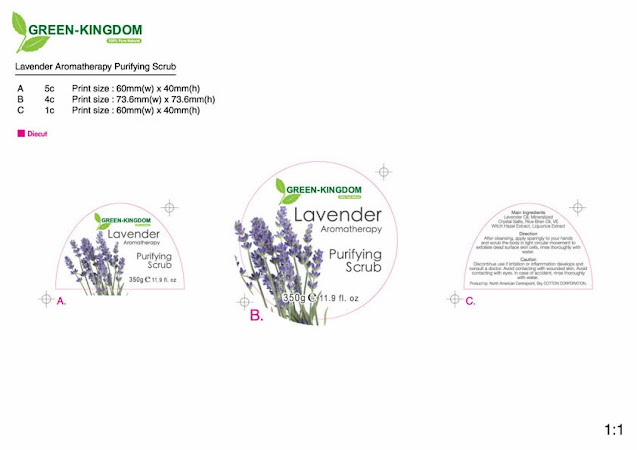
Sticker Design Review. The Green Kingdom this brand is selling skincare products. This design project is a design of the bottle sticker. 

There are a few important things to need special attention. The material used in the bottle. At this time bottle is transparent plastic. The size and diameter of the bottle will affect your design. Especially the sticker size, it is because the sticker needs to cover over the surface of the bottle body. Use one sticker or two stickers need to be considered. If the bottle's body diameter is thin, one sticker can be used. If the diameter is too big, you need to use two stickers. Two stickers are easier to label the stickers on the bottle. Also, pay attention to the color of the product. This time there are white lotions and purple lotions. In this time's design direction, customers want to use simple and clear design. According to this Design direction, so we focus on the typeface, font size, font color, and position, etc... In addition, we need to choose appropriate photos as the design element. Both products are in the same season series. The design will not affect the appearance of the two products. Everyone agreed to use a white background color sticker material, and below is the final design. (Below design has two different bottles) 


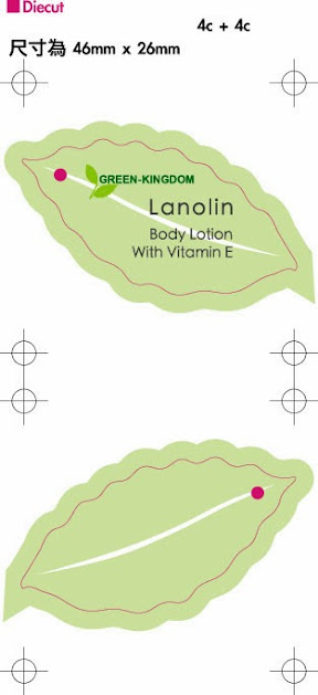
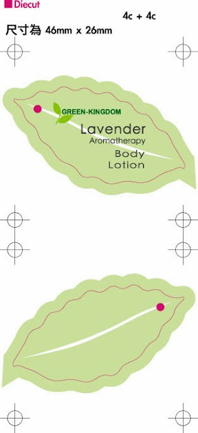
Green-Kingdom Hangtag.


I use this brand's main element leaf and green color to design this hangtag.
Double side printing. The front side is a product name. The backside is a barcode.


Magazine ad - Mascara - Perfume - NTP - Love passport - BERDOUES

Magazine ad - Mascara
Design Review


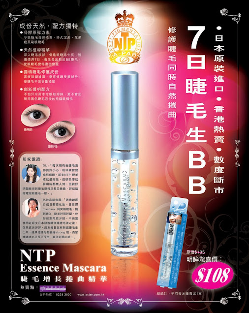
Mascara Magazine Adv Design. I believe Many ladies have used Essence Mascara. Design this magazine advertisement. First, take product photos. How to highlight the transparent bottle and liquid. In this design, the transparent bottle and liquid are added with color. The middle of the product has a light and bright color. The light-emitting position, the colorful color outside the product, the dark black color around out of the side, can increase the color sense of the composition. The white text has big, small, thick, and thin. All of these elements can constitute sufficient contrast. The composition of the photo and text is 1/3 2/3 The golden proportion is a good comfortable visual.


Mascara Magazine Adv Design.


Magazine ad - cosmetic - Love passport Perfume
Design Review


Love passport Perfume Design Review. This product has its own love story. You can see the bottle has love text, red color, flower shape, and heart shape. We also use Yellow color's bar and red color text to highlight the Limited Edition text. We use these important elements to design the perfume advertisement.


Love passport Perfume Design Artwork


Magazine ad - Bucolie Tale Violette Divine
Design and Photography Review


Magazine ad - cosmetic - MIZU - CHOIZE

Magazine ad - cosmetic
Design and Photography Review


MIZU Slimming Gel design and photography. The main ingredient is Chili and Ginger. We use Chili, Ginger, bamboo, and white cloth pattern to develop the visual. Photo's structure  1/3 is items, 2/3 is white cloth pattern, it is developed the golden standard. Center is the main product. The main product is bright orange. Around the main product's accessories, color let Slimming Gel is the eye contact point. The white color cloth area is the text area. The slogan, product name used orange color and big fonts size. Orange color has a burning meaning. Use a thin font to matches the slimming meanings. The description is used small fonts. All about these design elements can make a contrast, can make a comfortable visual. 


MIZU Slimming Gel Design and Photography


Magazine ad - cosmetic - Creative idea - Review


CHOIZE is the skincare brand represented by Aster cosmetic center. This time it was advertised in the magazine. I discussed with the marketing manager to understand the characteristics of this product. The CHOIZE series of products can achieve whitening, sun protection, and moisturizing. 

The design concept focuses on cleanliness. It is because the product's color is white, so colorful colors and complex textures are not be used as this background. We chose simple textures and light-colored fabrics as backgrounds, and tried our best to highlight the appearance of the product, and then used simple thick and thin fonts to make contrasts. 

Before taking this photo, we need to know how many texts will be put inside, so enough space was reserved for text & design is important, and take photos of the product layout was determined accordingly.

The text layout, marked with the star symbol, purple's color, and number, so that readers can easily know the product's name, information, and category.


Shoot this photo. We use thick and simple patterns towels to make this photo background.
There are nobly advanced beauty salon feelings.

Newspaper - cosmetic - Creative idea

Newspaper - cosmetic - Creative idea Review


Basically Aster Beauty Center publishes newspaper advertisements weekly. The main color of the brand is purple. There are two main categories of products that make a promotion. 

1 Product category is a keep fit and weight-loss product to maintain your figure, frame using red and fire shapes to bring out the idea of burning. 

2 Product category is a makeup remover product, with blue and round edges to bring out clean and clear ideas. 

When using two different outline borders, avoids the text and product display messy situation, and still keeps the text and product show is clear.

The red color and blue color have their own zone. In this zone's product effect is match the color. Red: lose weight, fat burning. Blue: water retention, boosting, revitalizing, energizing.


Ohmine Cup 100ml Sakura Limited Edition

  Ohmine Cup 100ml Sakura Limited Edition This photo is a retouched photo.   Ohmine Cup 100ml + Sakura background stock photo. More job ref:...